Christina Chung & the cover artwork for Issue 5
In this feature, we look at the design of Firewords more closely. This series of blogs will allow us to meet some of the creative talent we’ve worked with and find out why they made the design decisions that they did.
All the visuals and illustrations in the magazine are important to us, but one element has the most prominence and comes with extra responsibility: the cover artwork. This is the first thing people see on the shelves. Despite the famous saying, many people do judge a book by its cover! We aim for our covers to be eye-catching, hint at the theme of the issue and provide an enticing promise of what is to be found within the pages.

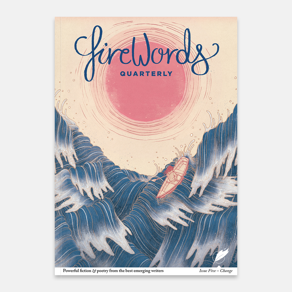
The stunning cover for Issue 5 was created by Christina Chung, an illustrator from Brooklyn, New York. Christina answers our questions and takes us through her decision making process.
FW: How did you come up with the initial idea for your cover?
CC: Keeping in mind the theme of the issue, Change, I sat down and asked myself what change meant to me. I was naturally drawn towards the idea of cyclical and natural processes, namely those found in the ocean. In my illustration for the cover of Firewords Quarterly’s 5th issue, I explored the idea of how the ocean is a part of so many different cycles and is always in a state of constant change. For this illustration, I used the ocean to symbolize life. I decided on using a criss-cross wave pattern not only as stylization, but also to represent the different directions that one is pulled in when going through life. As a recent graduate, my life is in a similar state and I identify a lot with the character rowing through the turbulent ocean in the illustration.

FW: How did it evolve over time and what were the refinement stages like?
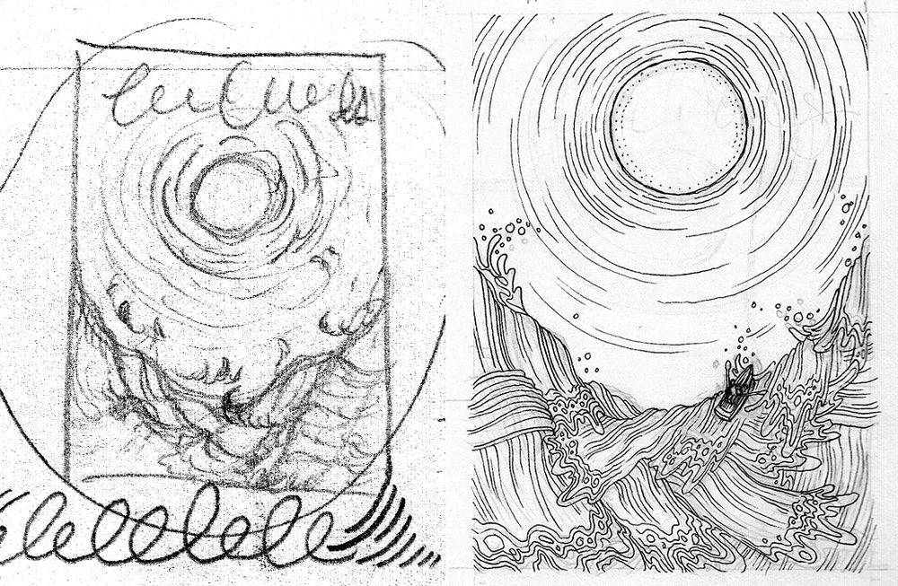
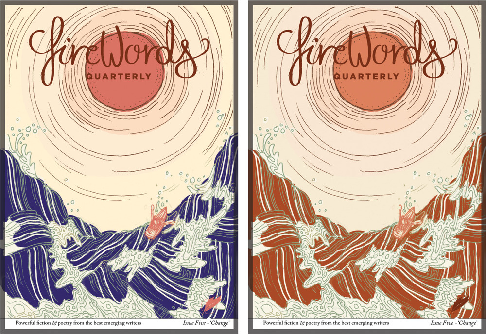
CC: Once I settled on the idea itself, I had to then figure out how to visually translate it from my mind to the paper. With my work, I go through several stages of refinement, from numerous thumbnails to more finished sketches. The Firewords team and I then further refined my finished sketches together, making small changes in composition and hierarchy. For me, it’s important to continue to work the thumbnails and sketches until I am happy with them, as well to listen to the client in order to create a piece that we are collectively satisfied and excited about.

FW: Can you explain how you normally create your artwork and how you brought this piece to life?
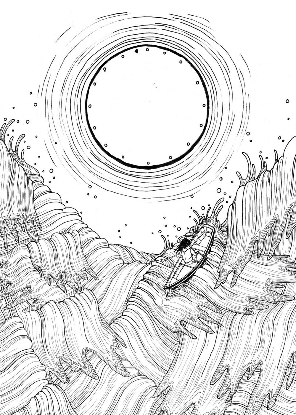
CC: My illustrations involve three main stages: sketching, inking and coloring. For my final illustration, I ink the lines of my piece and create textures with different mediums on separate pieces of paper. Afterwards, they are digitally assembled and colored. I chose to go with a pink and teal color scheme for dramatic emphasis and to create an interesting visual relationship between the subject and background of the illustration.

FW: Any other projects in the pipeline or current work you want to tell us about?
CC: Since illustrating the cover for Firewords I’ve been hard at work, namely working on editorial illustrations for clients such as Buzzfeed and The New York Times. I’m also in an amazing anthology project called 1001 Knights, created by Kevin Jay Stanton and Annie Stoll. It’s a 3-volume anthology that explores the meaning of strength and knighthood through people-positive, diverse and feminist characters. I’m very excited and proud to be involved, along with over 250 other artists. 1001 Knights was recently funded via a hugely successful Kickstarter campaign. I recommend everyone to check it out!

Christina Chung is an illustrator currently living and working in Brooklyn, New York. Her works are a blend of both traditional and digital media held together by a line and pattern-based style. Her work is sensitive, delicate and infused with symbolism.
You can find her recent work at www.christina-chung.com, where you can also read a little more about her. To see more process work and find out what she’s working on next, check out her Tumblr, Instagram or Facebook page.
If you enjoyed this post, check out the first case study we did with French hand-lettering artist Sarah Dayan and her work for the short story ‘The Old Garden of the Alcazar’ in Issue 3.

